 ENG
ENG- Branchen
- Finanzen
Nearshore-Softwareentwicklung für den Finanzsektor – sicher, skalierbar und Compliance-gerechte Lösungen für Banking, Zahlungsverkehr und APIs.
- Einzelhandel
Softwareentwicklung für den Einzelhandel – E-Commerce, Kassensysteme, Logistik und KI-gestützte Personalisierung durch unsere Nearshore-Engineering-Teams.
- Verarbeitende Industrie
Nearshore-Softwareentwicklung für die Industrie – ERP-Systeme, IoT-Plattformen und Automatisierungstools zur Optimierung industrieller Abläufe.
- Finanzen
- Was wir tun
- Services
- Technologien
- Kooperationsmodelle
Kooperationsmodelle passend zu Ihren Bedürfnissen: Komplette Nearshoring Teams, deutschsprachige Experten vor Ort mit Nearshoring-Teams oder gemischte Teams mit unseren Partnern.
- Arbeitsweise
Durch enge Zusammenarbeit mit Ihrem Unternehmen schaffen wir maßgeschneiderte Lösungen, die auf Ihre Anforderungen abgestimmt sind und zu nachhaltigen Ergebnissen führen.
- Über uns
- Wer wir sind
Wir sind ein Full-Service Nearshoring-Anbieter für digitale Softwareprodukte, ein perfekter Partner mit deutschsprachigen Experten vor Ort, Ihre Business-Anforderungen stets im Blick
- Unser Team
Das ProductDock Team ist mit modernen Technologien und Tools vertraut und setzt seit 15 Jahren zusammen mit namhaften Firmen erfolgreiche Projekte um.
- Wozu Nearshoring
Wir kombinieren Nearshore- und Fachwissen vor Ort, um Sie während Ihrer gesamten digitalen Produktreise optimal zu unterstützen. Lassen Sie uns Ihr Business gemeinsam auf das nächste digitale Level anheben.
- Wer wir sind
- Unser Leistungen
- Karriere
- Arbeiten bei ProductDock
Unser Fokus liegt auf der Förderung von Teamarbeit, Kreativität und Empowerment innerhalb unseres Teams von über 120 talentierten Tech-Experten.
- Offene Stellen
Begeistert es dich, an spannenden Projekten mitzuwirken und zu sehen, wie dein Einsatz zu erfolgreichen Ergebnissen führt? Dann bist du bei uns richtig.
- Info Guide für Kandidaten
Wie suchen wir unsere Crew-Mitglieder aus? Wir sehen dich als Teil unserer Crew und erklären gerne unseren Auswahlprozess.
- Arbeiten bei ProductDock
- Newsroom
- News
Folgen Sie unseren neuesten Updates und Veröffentlichungen, damit Sie stets über die aktuellsten Entwicklungen von ProductDock informiert sind.
- Events
Vertiefen Sie Ihr Wissen, indem Sie sich mit Gleichgesinnten vernetzen und an unseren nächsten Veranstaltungen Erfahrungen mit Experten austauschen.
- News
- Blog
- Kontakt
Website accessibility audit: How ProductDock improved WCAG 2.2 compliance.

Mission: Improve accessibility

Solution: Accessibility audit

Tech stack: HTML, WAI-ARIA

Collaboration model: Internal team
Summary.
As accessibility standards and expectations continue to evolve, even well-built websites benefit from periodic review. In 2021, when we first built the ProductDock website, the accessibility standards we followed were not the same as those we consider essential now. We saw this evolution in standards as an opportunity to apply our own audit and remediation process.
This success story shares how we evaluated our website, prioritized issues, and improved accessibility, demonstrating how accessibility looks in practice and our commitment to delivering the best user experience.
If you are still not sure why accessibility is important and how it affects your product, check our article “5 key facts you need to know about digital accessibility.”
About.
Can you tell us about the project?
The ProductDock website serves as an entry point for potential clients, future teammates, and the global community that engages with our blog section.
Our main goal was to identify and fix the biggest accessibility barriers. To achieve that, we conducted an internal accessibility audit to uncover accessibility issues and measure our site against WCAG standards. Our goal wasn’t just compliance; it was to ensure a seamless experience for every visitor.
What is an accessibility audit?
An accessibility audit is an assessment of a digital property against the Web Content Accessibility Guidelines (WCAG), a set of guidelines and technical standards for making the web accessible to everyone. It implies verifying all success criteria through a combination of manual and automated testing.
The combination of different testing methods allows for the discovery of a large number of issues that automated tools alone fail to detect, making audits a reliable way to evaluate accessibility.
After an audit is completed, a report is provided with a prioritized roadmap of actions needed to meet the WCAG guidelines and to significantly reduce the risk of poor experiences for users with disabilities.
Initial situation.
What was the initial state?
Although the team already had accessibility considerations when designing and implementing, no accessibility testing was ever done before.
What was the team structure?
5 key roles contributed to the team’s success:
- Accessibility auditor: conducted the website review.
- Designer: Addressed design-related issues.
- Developers: Fixed structural and code-related problems.
- Copywriter: Reviewed and refined all website copy.
- Marketing director: Supervised the process and managed the improvements.
Opportunity space.
What challenges did you tackle?
Scope
The website features 52 main pages plus an additional 100-150 content pages, such as blog posts, case studies, and success stories. A full audit requires considerable time to evaluate, but since the website has a consistent, repetitive structure across many pages, we were able to review all main pages and examples of content pages. Although, for most cases, it’s best to prioritize a selection of the most important pages or user journeys.
Devices
Our website is fully responsive, but we concentrated our efforts on testing mainly the desktop version using both Mac and Windows operating systems. In the future, we intend to include more mobile testing.
WCAG
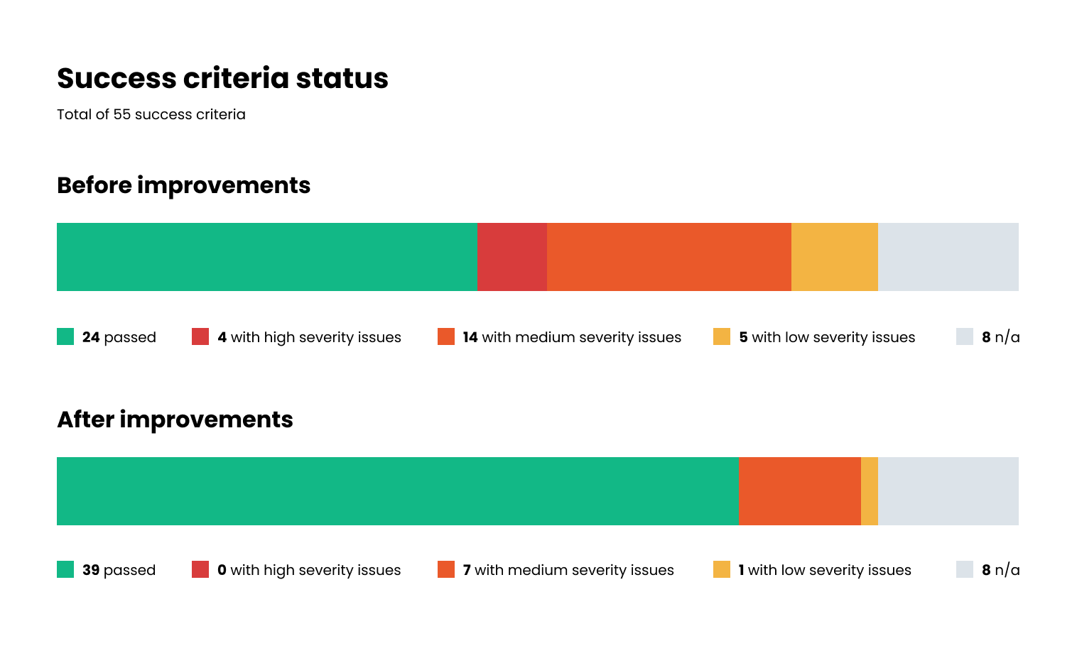
We decided to test using the latest version of WCAG (2.2) with the compliance level AA, which resulted in 55 success criteria. This level ensures good accessibility for the majority of users visiting the website.
Solution.
Accessibility testing methods and tools used
Testing methods
As mentioned before, audits require a mix of automated tools and manual testing. Most automated tools can only uncover up to 40% of issues, since they can only flag code misuse. As a result, a website can appear to have a “perfect score” but still be completely unusable. Automated tools cannot determine if the content is meaningful or logical to users, which can lead to a false sense of compliance. To properly test usability, it’s essential to test using assistive technologies. Some of the tools and methods used:
- Screenreaders (VoiceOver / NVDA): Testing content, navigation, and interactive elements as a blind user would.
- Keyboard-only navigation: Verifying that all functionality is operable using only a keyboard and checking for a visible focus indicator and logical tab order.
- Browser zoom: Checking that content adjusts correctly to different screen sizes without horizontal scrolling when zoomed up.
- Color contrast checkers: Ensuring text and interactive elements meet contrast ratios.
- Headings and landmarks evaluation: Verifying correct use of headings for content hierarchy and proper landmark structure.
- Automated testing tools (axe DevTools / WAVE / Accessibility Insights for Web): Identifying common code-based errors.
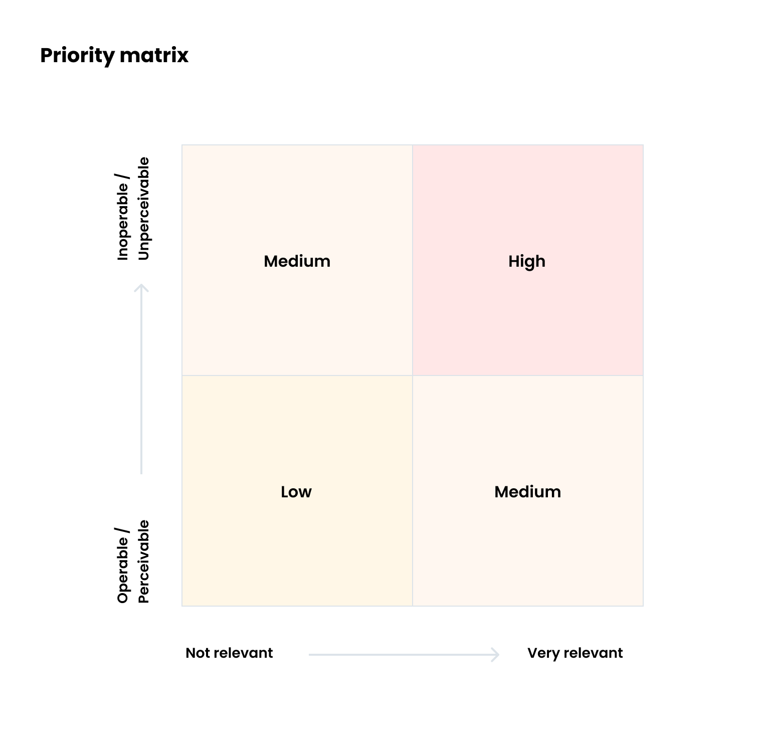
Strategy & prioritization
Every issue found was categorized by severity level using a matrix. The vertical axis corresponds to the range of operability and perceivability of the content. The horizontal axis corresponds to the content’s relevance range.
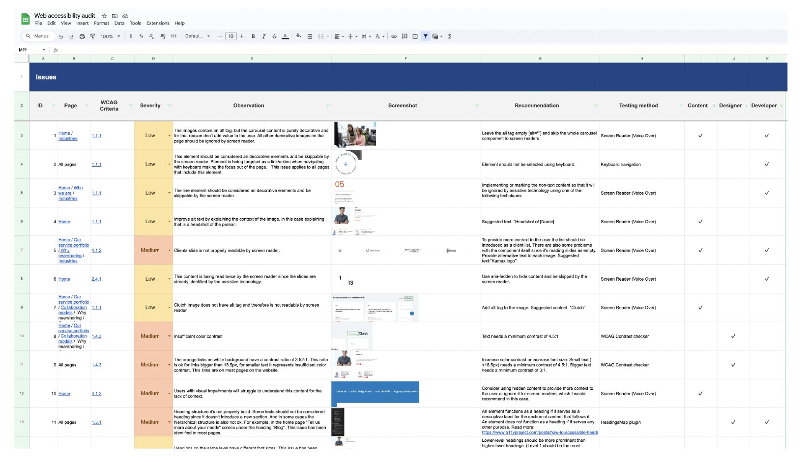
For each issue identified, we provided a recommended solution and assigned a responsible party to implement the fix. Our workflow consisted of the auditor signaling the issue, the responsible team fixing it, and then the auditor checking again to verify it was working properly.
What was the outcome?
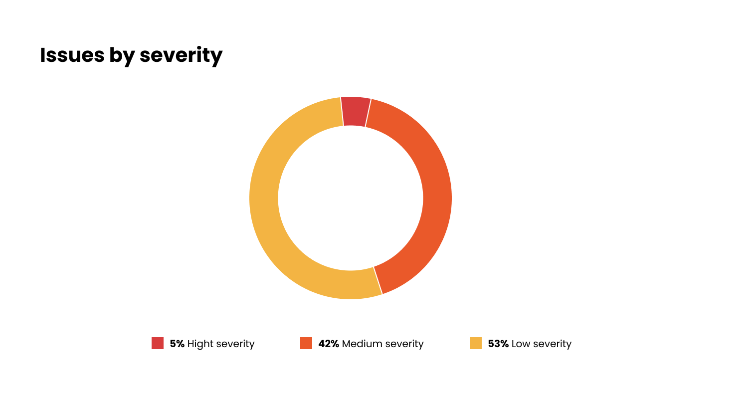
The audit resulted in a list of issues for the team to tackle. Of the issues found, 5% were deemed critical and prioritized for immediate resolution, while the remainder were classified as low to medium severity.
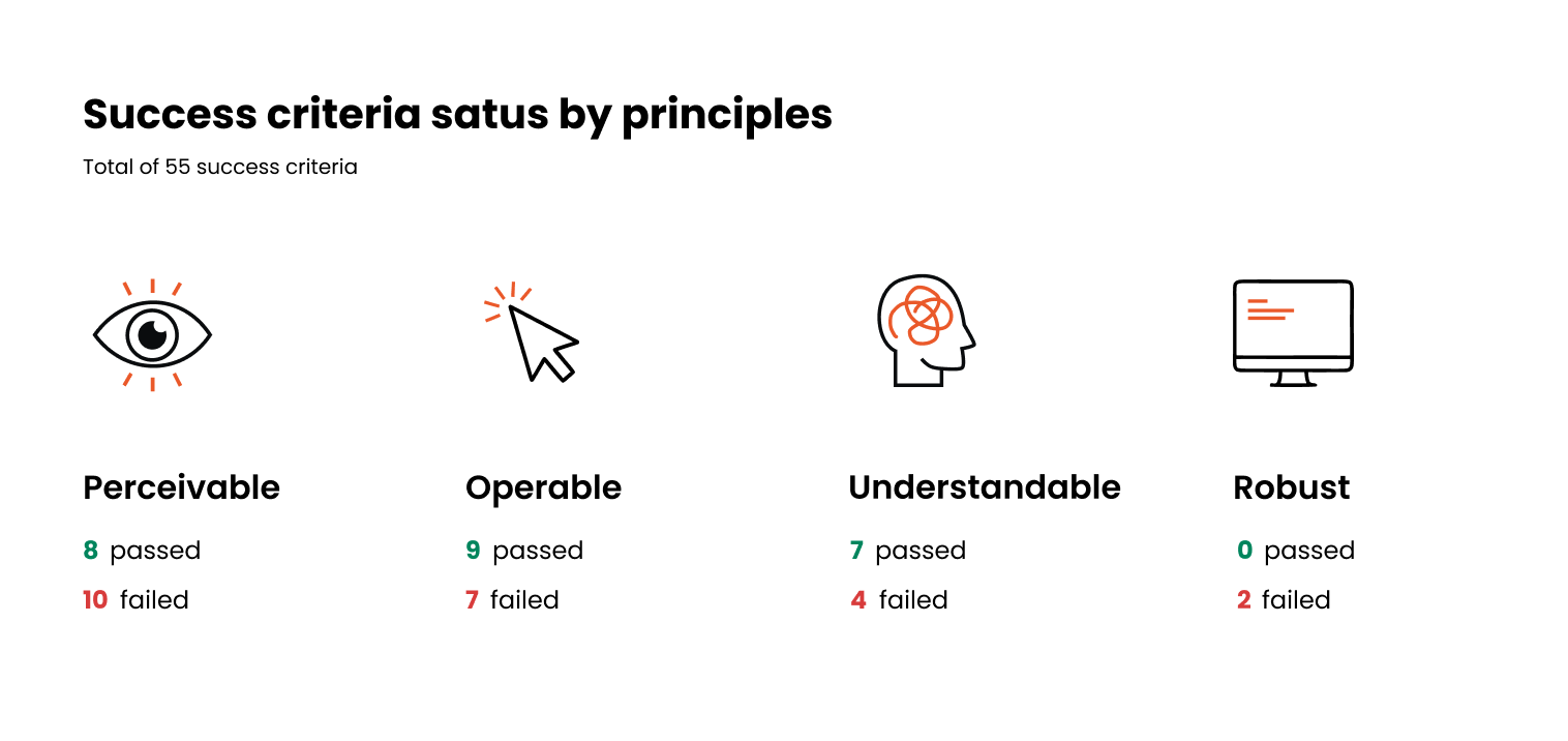
Each identified issue corresponds to a specific accessibility principle. The “Perceivable” principle had the most violations, failing 10 success criteria. This principle dictates that information must be presented in a way that users can perceive through sight, hearing, or touch.
In less than one month, the team solved 89% of the issues and fixed all high-severity issues, a great achievement. In terms of WCAG compliance, it moved from 24 success criteria passed to 39.
Some components that presented issues, like our chatbot, are developed by third-party providers and, therefore, are not possible for us to fix at the moment.
Key improvements.
Alternative text for images and media
The website is rich with different media, from team photos and videos to technical diagrams. For screen reader users, it’s important that all media be paired with a text alternative that can be read by assistive technology and transmitted to the user. Most of the content on the website already had alternative text, but on closer inspection, we noticed two common issues: the alternative text either did not describe the image or was used unnecessarily for decorative images.
After the audit, our content team identified which images were decorative to reduce screen reader clutter and which needed more informative descriptions to ensure they conveyed the same value as the visual content.
Heading structure
Headings communicate the page’s content organization. Web browsers, plug-ins, and assistive technologies can use them to provide in-page navigation, allowing users to identify interesting topics and navigate directly there instead of having to scan the entire page to find what they are looking for. We found that although visually correct, some of our headings were not hierarchical, which could affect the user’s perception of the content structure.
Keyboard navigation
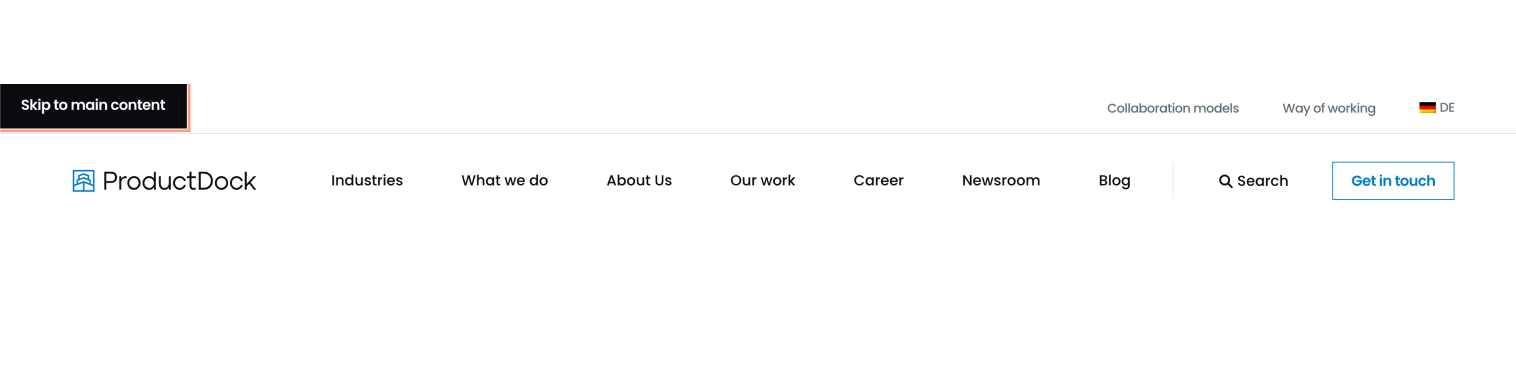
Some of the most critical issues found were due to poor keyboard navigation, which is the primary interface for many users with motor disabilities. Our previous navigation header did not allow keyboard access to sub-pages and was one of our top issues to fix. We also discovered “keyboard traps” in overlays: areas where, once entered, it is not possible to leave using only the keyboard, resulting in a very frustrating experience for users.
To facilitate navigation, we have also included a “Skip to main content” link that lets users bypass navigation elements and go straight to the page’s content.
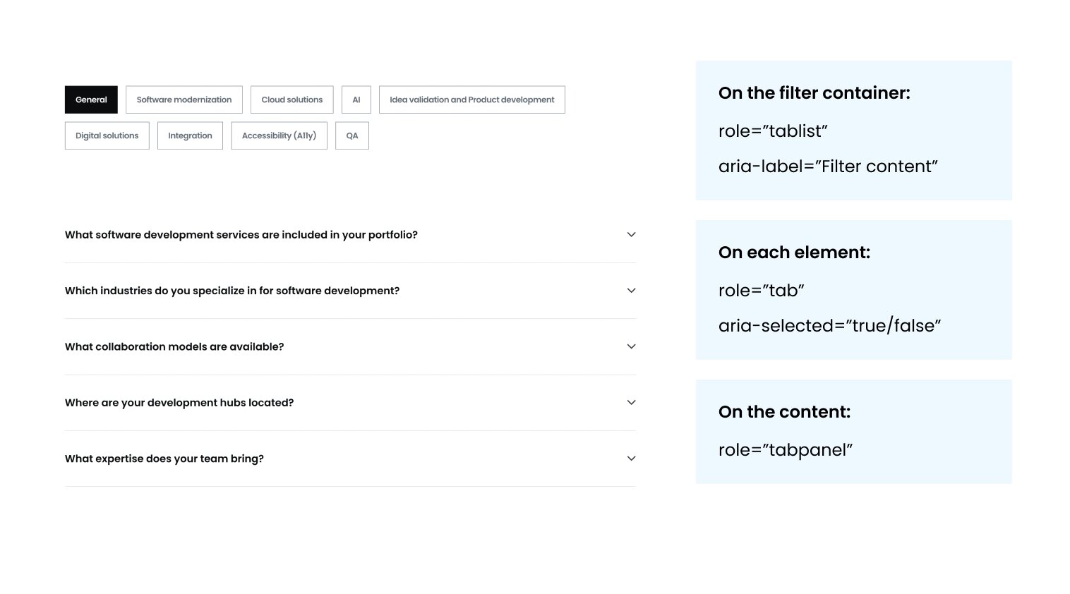
Understandable custom components
Semantic HTML tags allow screen readers to convey the purpose of a component. For example, using <button> or <a> immediately tells a user if an element triggers an action or navigates to a new page. Our audit revealed issues where custom components (like our filters and carousels) lacked these native semantics. To fix this, we implemented ARIA (Accessible Rich Internet Applications) roles and attributes to provide the necessary context.
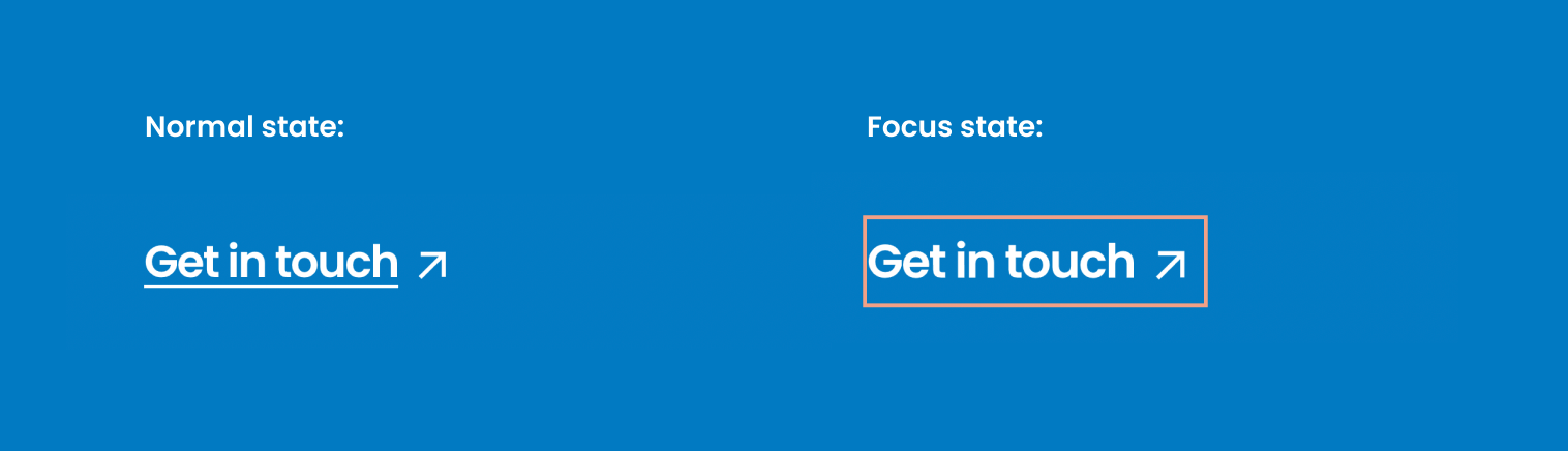
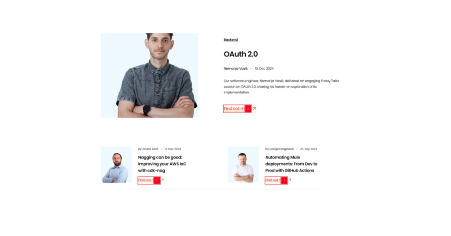
Clearer links
We improved several link descriptions to provide better context to screenreader users. Additionally, we addressed inconsistent focus states that, in some cases, lacked differentiation from the normal state. For keyboard users, a clear focus state acts as a visual anchor, indicating which component is interactive and where it is on the page.
Improved color contrast
Most of the website met color contrast guidelines, but there were still some areas where it did not. Users with low vision or color blindness often struggle to read text with poor color contrast, especially when the text is small. One of the cases we found was that our brand orange links met color contrast requirements when the font size was large (above 18pt or 24px), but failed to meet the requirements at smaller text sizes.
Results.
Lessons learned from our accessibility audit
Overall, this process was very insightful and a learning process for the team. Here are some things we would like to share:
- Getting a long list of issues to fix might be overwhelming, so having a good prioritization structure is key.
- Many of the identified issues were recurring across multiple pages, meaning that a single solution can often address a group of them.
- Accessibility is only possible if all roles collaborate in this process.
- It’s always preferable to consider accessibility from the start. Including accessibility acceptance criteria as part of the development process can save time and money in the long run.
- To maintain compliance with accessibility standards, we’ve created structured guidelines for future implementations and a knowledge-sharing hub to keep teams informed about best practices.
- While compliance is important, it doesn’t guarantee that users with disabilities won’t face issues. The most valuable insights come from real users, which can be gathered through methods like usability testing with people with disabilities using their own assistive technologies.